Case study · Past company

Bue

A lifestyle company that designed, manufactured and sold premium medical equipment and mobility products. Our goal was to take something boring and medical and make it desirable and attractive, and in doing so, change the narrative around aging and mobility.

New YorkHealth & homeFounded and operated
The intention

From beige and boring to something people want.

Medical equipment and mobility products had looked the same for decades: beige, clinical and designed only to function. They told the people using them that something was wrong. We set out to change the space by adding style without giving up function, and by marketing it the way you would market a lifestyle brand.

Every detail and every element was intentional and carefully selected: the name, the circles in the mark, the colors, the typefaces, the curve of the arms, the way the chair folds, the people in the photos and the channels we built to reach them. Nothing was left to default.

What we built

A safety product people wanted to own.

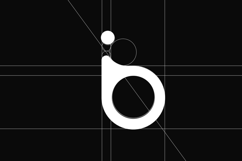
The Bue mark on its construction grid

Brand

A medical equipment and mobility brand with a short, friendly name and a calm, residential look, so its products felt like they belonged in a well-designed home.

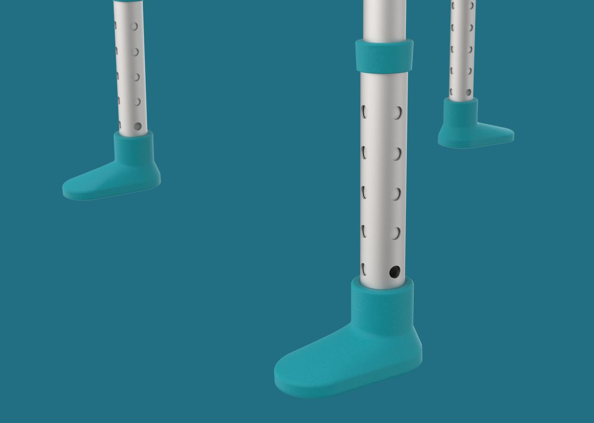
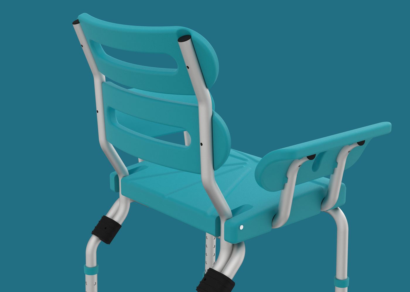
Rendering of the Bue Shower Chair's rotating feet

Design

Designed in the U.S. with the inventor of the HurryCane®. Rotating feet moved outward for the widest, most stable base, with curved arms to guide you in and out.

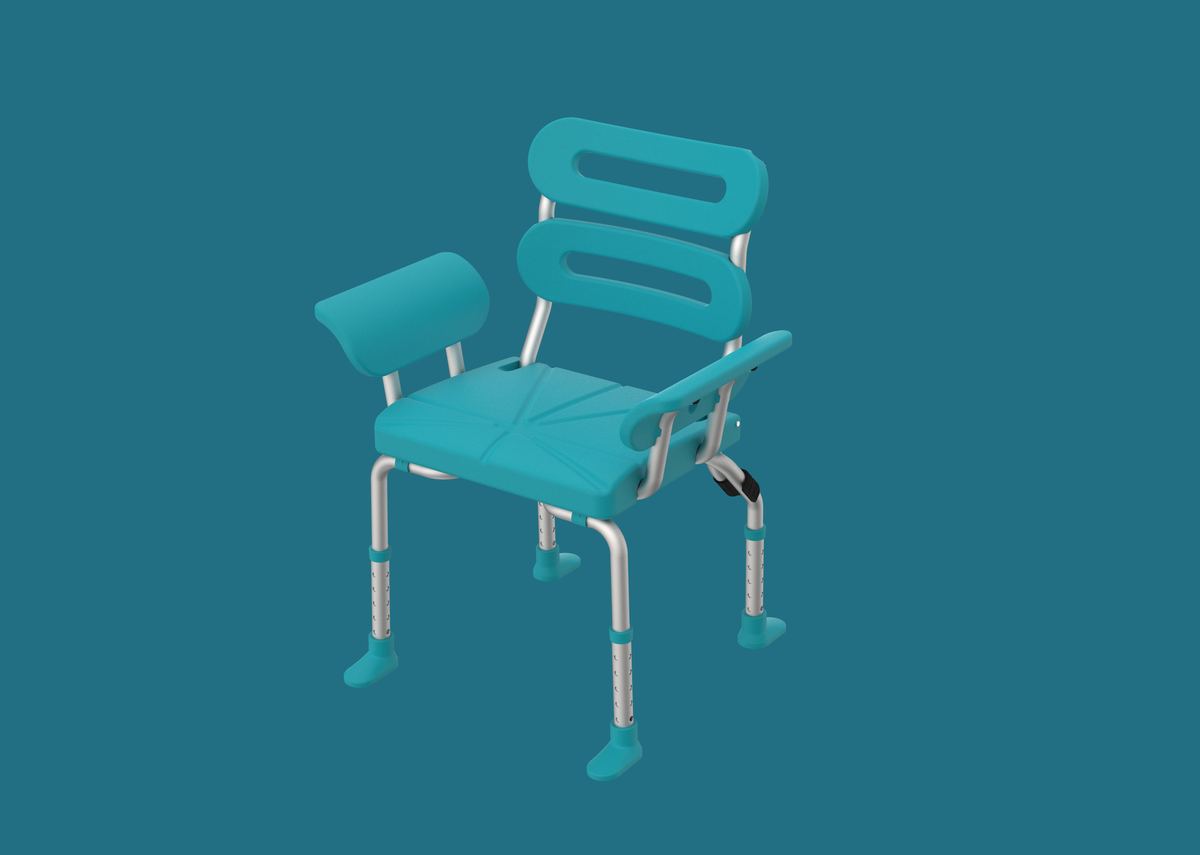
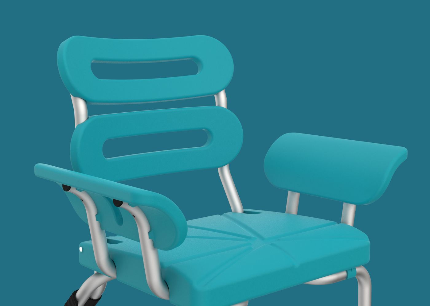
Rendering of the teal Bue Shower Chair

Product

The Shower Chair: fully foldable, shipped assembled, 11.6 lbs, holding up to 350 lbs, backed by a 100 Showers Guarantee. Followed by a line of ADA-compliant stainless steel grab bars.

Product design

Renderings and animation
Every angle, then folded flat in one motion: the chair ships assembled and folds for storage or travel.
Close-up rendering of the back of the Bue Shower Chair
Close-up rendering of the seat, backrest and curved arm of the Bue Shower Chair

Brand identity

From the Bue Brand Playbook

Brand purpose: Make the world move better.

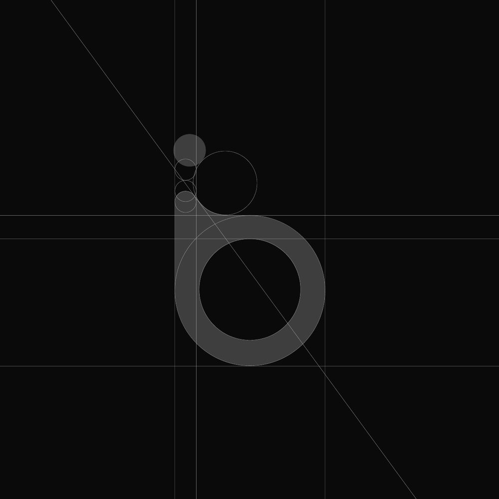
Construction circles and guides for the Bue logo mark
1. Circles. The mark is made entirely from a series of circles on one grid.
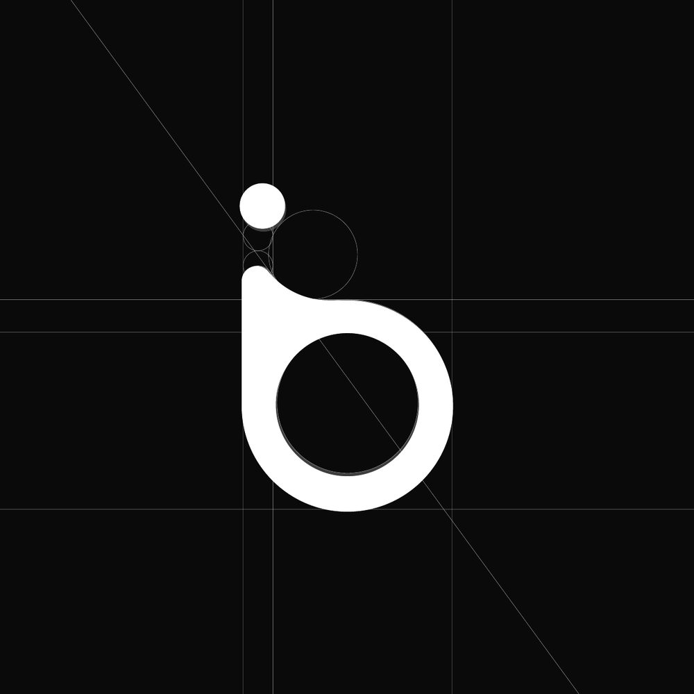
The Bue logo mark formed from its construction circles
2. Mark. The circles resolve into a single shape that is both the letter “b” and the accessibility icon.
The final Bue lockup: the mark above the lowercase bue wordmark
3. Lockup. A geometric wordmark built on the same circles, with an optically refined “e” and softened corners, set to balance the mark.

Color palette

Four primary colors, five secondary colors and a range of neutrals. No absolute black, so the palette stays warm next to the primaries.

Primary
Hyper Violet#494EE7
Golden One#F7D147
Midnight#0B1E46
Celia#51A9BC
Secondary
Tiger#E9833B
Cold Blue#ABC5EA
Pink Berry#EC6A5C
Ox#E4D4C3
Deep Aqua#224145
Neutrals
Off Black#0E0E0E
Shadow#222222
Fossil#3D3B3B
Smoke#AFACAC
Heather#EBE9E9
White Flag#FFFFFF

Typography

Two geometric sans serifs that echo the circles in the mark.

Modern Era

The primary typeface for brand touch points and interface, used in bold for headlines, subheads, labels and numbers.

Axiforma

Used for body copy: regular for reading, light for call-outs and bold when citing references.

Graphic elements

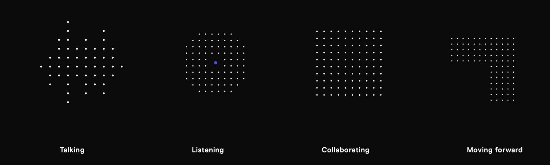
A single dot stands for one person going through a change, like getting older or adjusting to a medical condition, and moments that can feel lonely. Grids of dots show what happens when people come together: talking, listening, collaborating and moving forward.

Four dot patterns labelled Talking, Listening, Collaborating and Moving forward

Element use

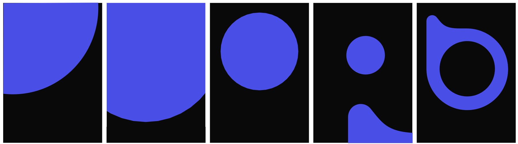
Crops of the logo's own shapes, the circle, the dot and the curve of the “b”, used at different scales either to hold content or as a background, so even a corner of a layout reads as Bue.

Five layouts using cropped Hyper Violet shapes from the Bue logo on black

Imagery approach

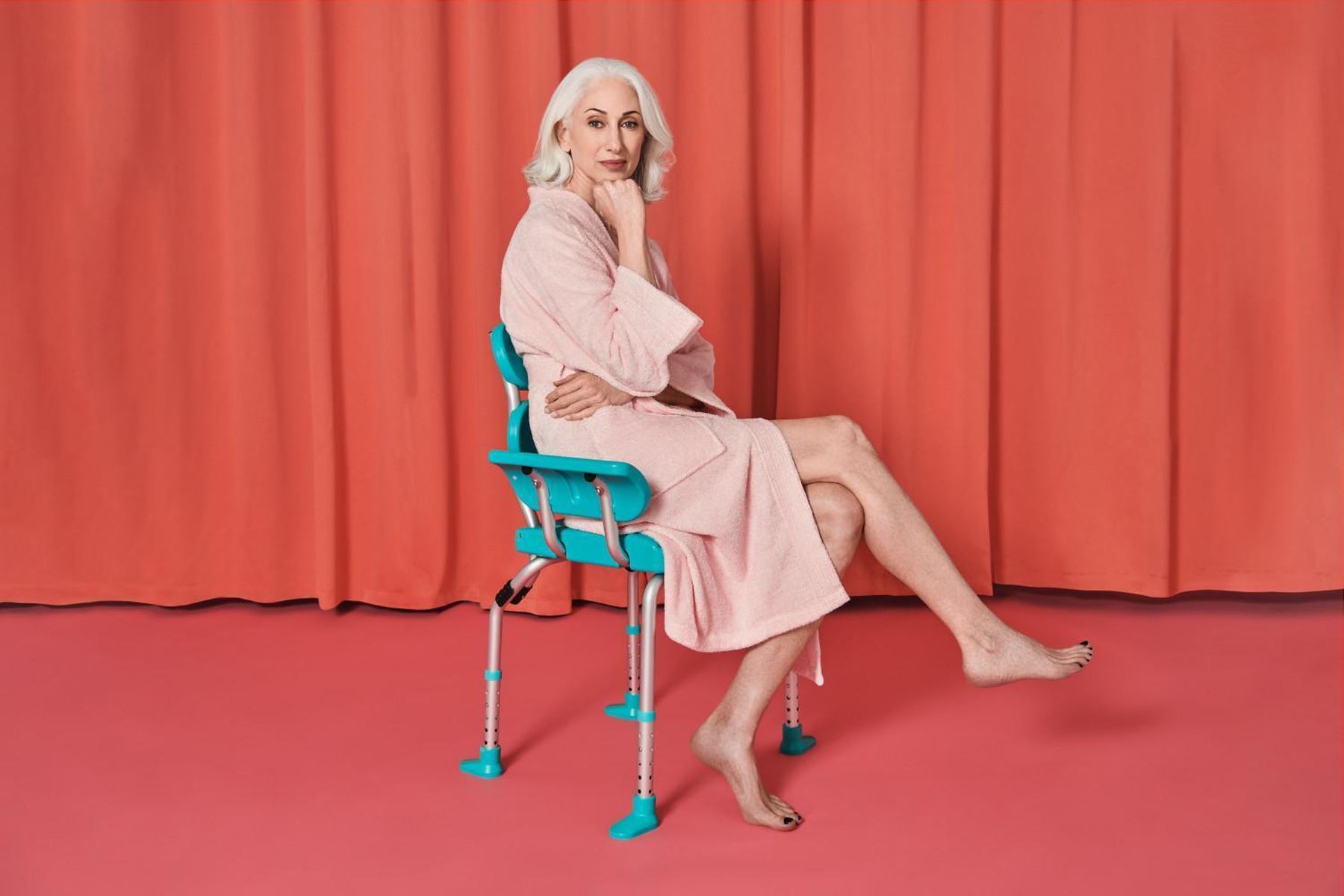
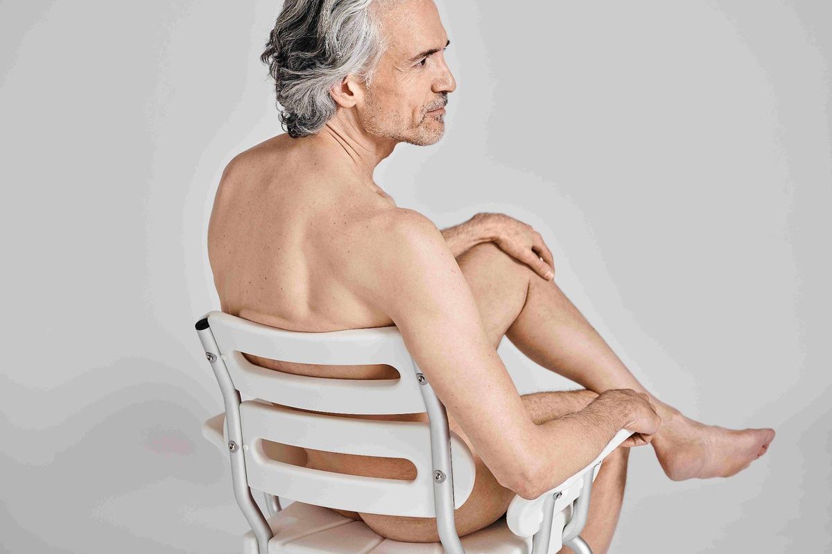
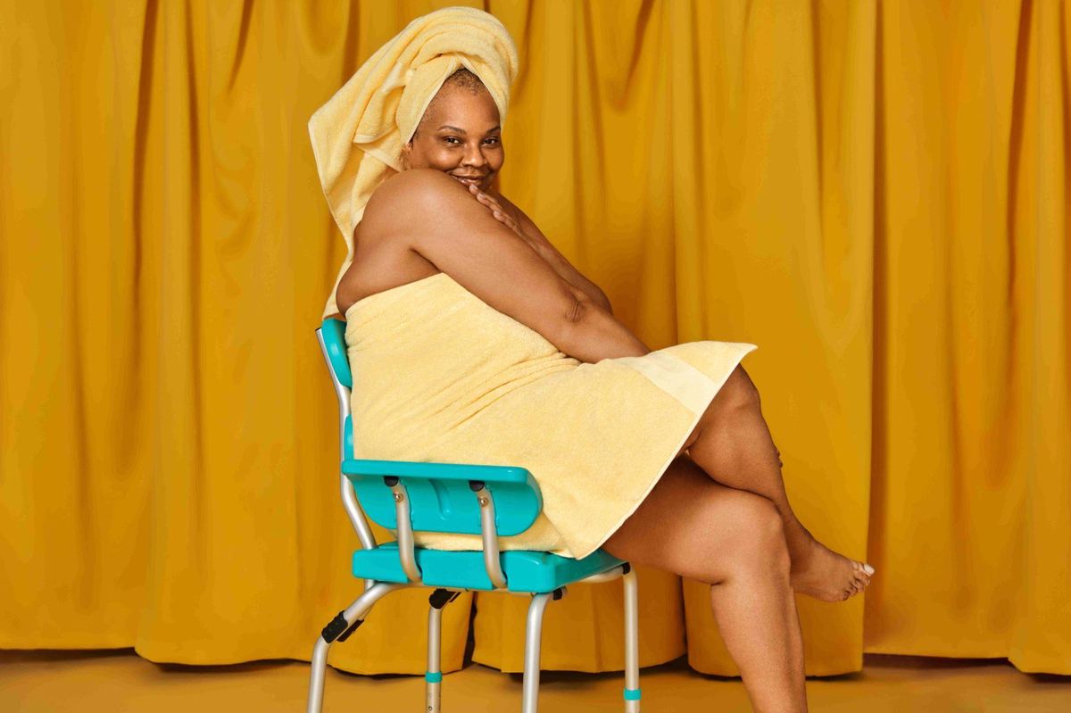
Three moodboards directed every shoot, and you can see them at work in the launch campaign at the top of this page.

Moodboard of design-brand furniture and product photography in deep blues, greens and bright color blocks
Fashionable

Shoot the product the way design brands shoot a release. Make every shot count, get up close and from every angle, color-block or go mono-tone, tease the colors, and show the product elegantly in a real setting.

Moodboard of close-up furniture details: wood legs, leather and metal joins, sculpted white curves
Engineered

Don't give too much away in one shot. Zoom in and show off the engineered curves, materials and build quality of the product.

Moodboard of saturated single-color bathroom scenes with people posed playfully
Functional · Colorful · Fun

Lean into the color palette, because color is one of Bue's biggest selling points. Use people to show how the product works and to tell the story; including them gives a safety product a human quality.

Moodboards from the Bue Brand Playbook. Reference imagery collected to direct our own shoots.

Copywriting & creative approach

Creative platforms for the launch

Say the thing no one else would.

Shower chairs had always been sold quietly, as something to tuck away in the other bathroom. We wrote Bue the other way around: confident, a little cheeky and proud of the product. Each creative platform pairs a line with how it comes to life across video, social and the real world. Two led the way.

01

It’s hard to not talk about it.

You’d never tell anyone you use a shower chair. But taking a shower with Bue isn’t embarrassing, it’s enlightening. Bue chairs are meant to be shown off, not hidden away. Once you try it, you’ll want to tell the world.

In the work
  • Friends on FaceTime getting ready in their bathrooms, who can’t stop dropping their Bue into the conversation.
  • Word of mouth on social, in owners’ own voices: I had my second shower today. Because Bue. My Bue folds up so easily. But I just can’t bear to put it away.
  • A woman who talks about Bue at work, over the garden fence, at a dinner party and at the theater.
Tagline: Bue. I have one.
02

Functional. Beautiful.

Bue chairs are made to be seen. We have nothing to hide, so let’s just show the chair and all the details to the world.

In the work
  • Film the chair the way you would shoot a luxury car, highlighting the sleek lines and ergonomic details before revealing it’s a Bue.
  • Install it in a pristine white gallery with a shower falling like rain on the chair.
  • Treat it like an Eames chair and place it in surprising public places, where people can discover it.
Line: It’s not only super functional, it’s super beautiful.
Also explored Nothing to hide.This is not a chair.Every day is a good day.
Building an audience

Two channels, over 90,000 followers.

We built the brand's own community on @movewithbue, and alongside it Art in Aging, a media channel celebrating people aging, thriving and inspiring, that gave Bue a marketing channel it owned outright.

Both fed a direct-to-consumer store with phone ordering, an editorial blog for adults over 50 and the people caring for them, and email campaigns built around the launch.

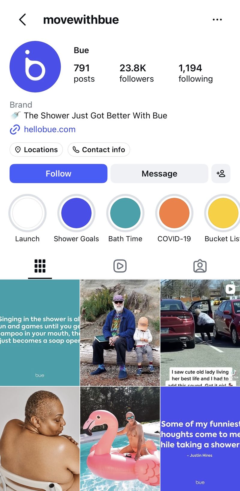
The @movewithbue Instagram profile: 791 posts and 23.8K followers
23.8Kfollowers · 791 posts
@movewithbueThe brand
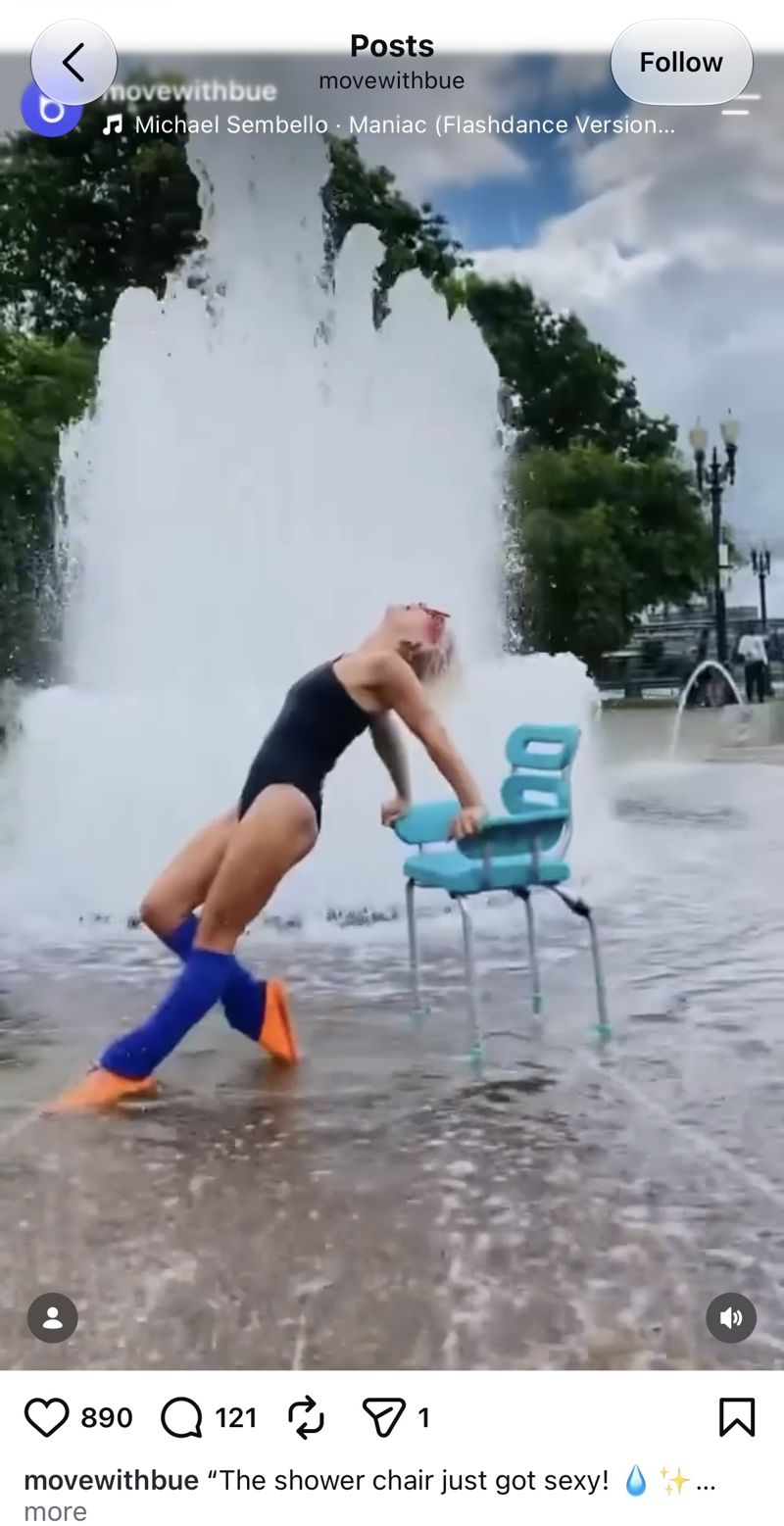
An influencer in a black swimsuit and blue leg warmers dancing with the teal Bue Shower Chair in front of a city fountain
890likes · 121 comments
“The shower chair just got sexy!”Influencer post
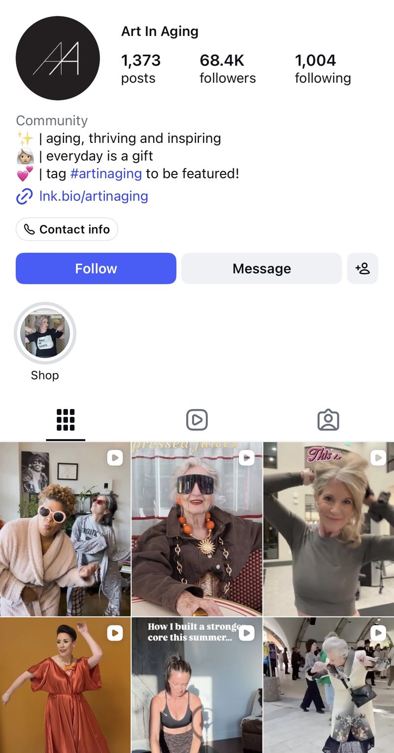
The @artinaging Instagram profile: 1,373 posts and 68.4K followers
68.4Kfollowers · 1,373 posts
@artinagingThe media channel

We worked with creators to show the chair in ways no one expected from a shower chair: here, as a dance partner in a city fountain, set to “Maniac” from Flashdance.

More case studies

All case studies →