Case study · Partner company
Wellsom
Oral care for dry mouth, bad breath and the appliances that keep your mouth healthy. Developed with dental experts and sold through dental practices and direct to consumers.
The intention
Clinical results, calm design.
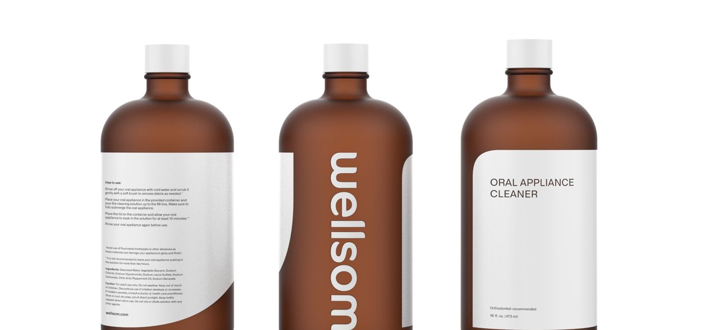
Mouthwash aisles are loud, neon and full of claims. Wellsom took the opposite route: amber apothecary bottles, a soft navy and pastel palette, and a clean typographic logo, so a product dentists recommend could sit on a bathroom shelf like something you chose.
Brand identity
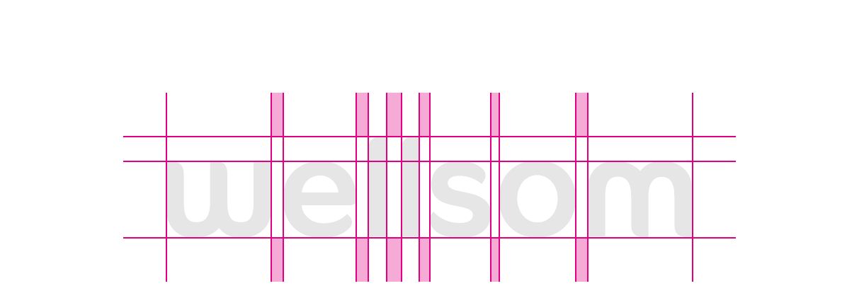
Logo, color and graphic elements
Navy
#2B497ABright White
#FFFFFFBlanc de Blanc
#D9D9D5Saltwater Slide
#C8E0EBHint of Mint
#DFEFE4
Voice
Lines from the site and packagingLet’s talk about your mouth.
Say goodnight to dry mouth.
A cleaner mouth starts with cleaner appliances.
Better together.
Applications
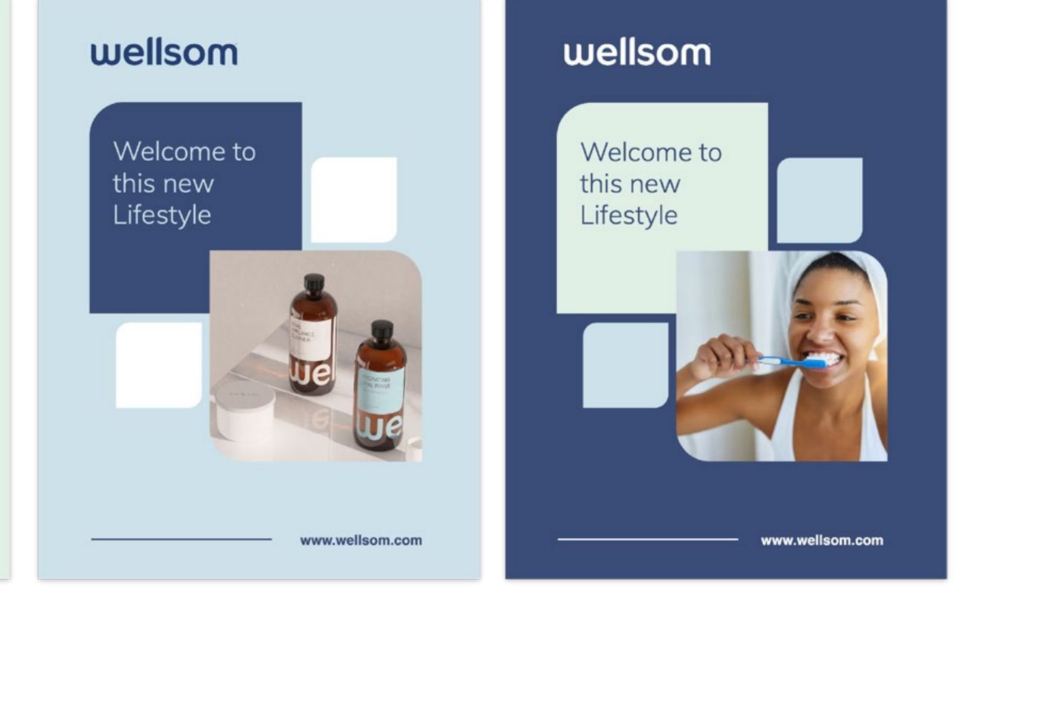
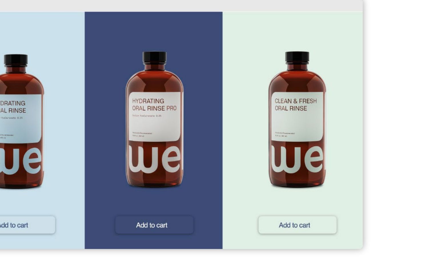
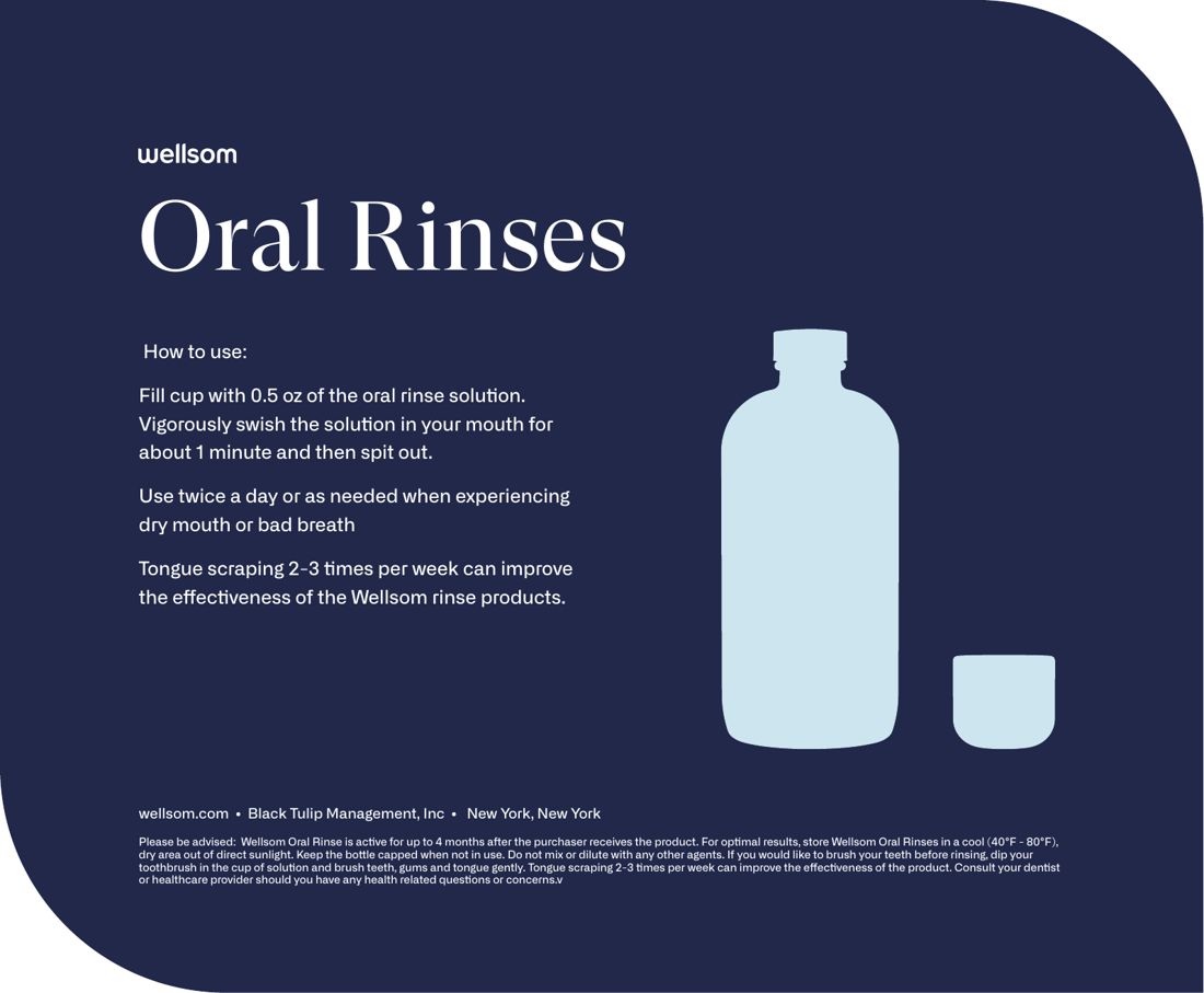
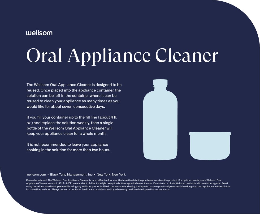
Posters, web and patient mailers